Last week I was asked to sit on a panel at the UK Society of Technical Analysts with 4 fellow members of the board, with a brief to review 2017 and offer some outlook for 2018, according to the charts of course! I was reasonably heartened to note that we were fairly well agreed on many of the things we said, although the direction of the US dollar did seem to divide opinion.
To a person we all seemed to agree that Equities were bullish, and it wasn’t one to be getting in the way of. This has been a good mantra to live by in recent years, particularly in the US. One of the most well followed Twitter accounts on my timeline is @RampCapitalLLC, a parody account that mocks anyone with the temerity to say anything Bearish about the Dow and cheers louder than Donald Trump every time another “000” milestone is reached. He/she is a firm advocate of “Keep Calm and Buy the Dips” which has turned from parody into a solid investment mantra… and the dips keep getting shallower too!
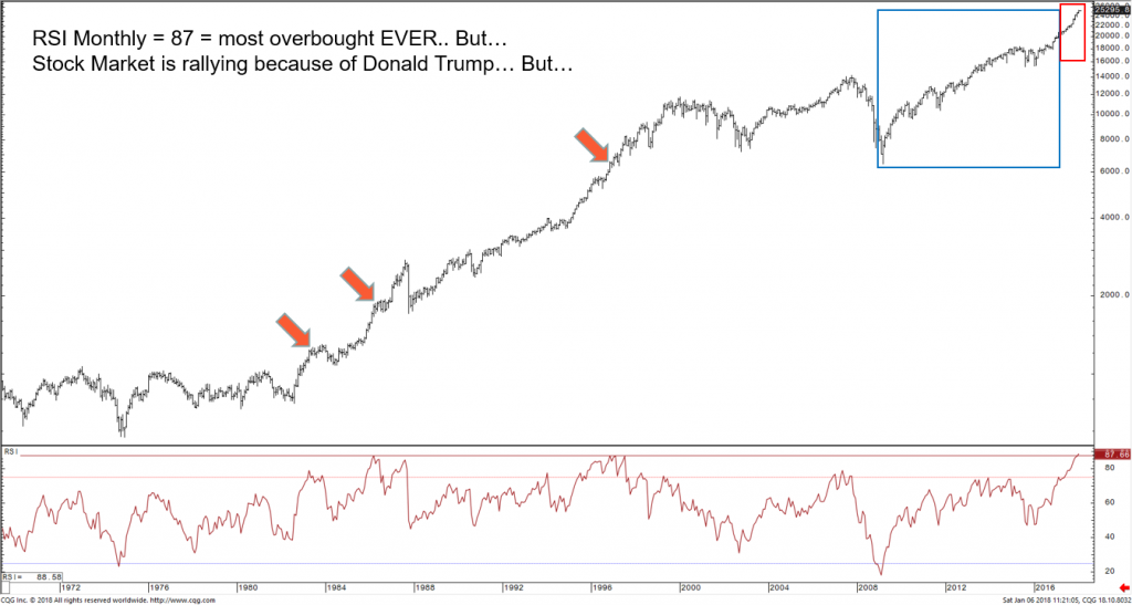
One thing I did note in my STA talk was that the rally in Stock Markets under Mr Trump looks pretty miniscule versus the gains seen when the previous bloke was in office, as per our below.
I also noted that RSI was overbought on the Daily, Weekly and Monthly timeframes, but then debunked this by showing the previous times we had the same situation. As you can see from the chart none of these marked a major turn in the markets. It should be remembered of course that RSI being overbought is not a sell signal in itself and that the original works of Mr Welles Wilder, who came up with this indicator in the first place, actually say that a sell signal comes when the indicator COMES OUT of overbought.
Chart: US Markets under Trump and Obama, plus the times when RSI has been overbought… and the market hasn’t turned!
So for now we’re bullish on Equities in the US and there is little sign of this turning around. Our reports of late have warned things are getting overstretched on the basis of the gaps that are appearing on the “day session only” charts and if a few of these start getting “ticked off” with weakness, and if we created a few “Islands” in the process then yes, a rethink might be required. These are an important aspect of our daily reports and we will be keeping a close eye if/when some red appears on the charts.
The FTSE 100 (and the FTSE 250) made a new all time high at the start of this week although there has been a small pullback since, with the strong pound seemingly getting the “blame”. It’s interesting to note at this time that the “strong pound” is probably more to do with a weak US Dollar, as the chart for EURGBP is a pretty flat/choppy/sideways affair still, and has been for months. This chart does look like it may be on the cusp of a move, however. Watch this space!
The DAX is lagging behind, relatively, having not made a new all time high since November. Poor thing. There have been signs of tiredness in this one of late, but it’s not really turning into anything yet, and probably won’t all the time US Markets continue higher.
You may have got this far and are thinking “What are the key levels, then?”, “What are the upside projections according to Clive’s old buddy Mr Fibonacci?”, “What are the key supports, trendlines or Moving Averages that need to break to see a change in sentiment?” I’m not going to tell you! My clients will know first, as they get a report every morning. As well as covering the FTSE and DAX we also cover the Eurostoxx 50, and in the US our reports cover the Dow, the S&P 500 and the NASDAQ.
It may be a good time to subscribe so you know when things are on the turn according to the charts. This cannot go on forever, but I’d like to think Technical Analysis will do what it does best and give ample warning if and when things turn.

